Simple and Colorful

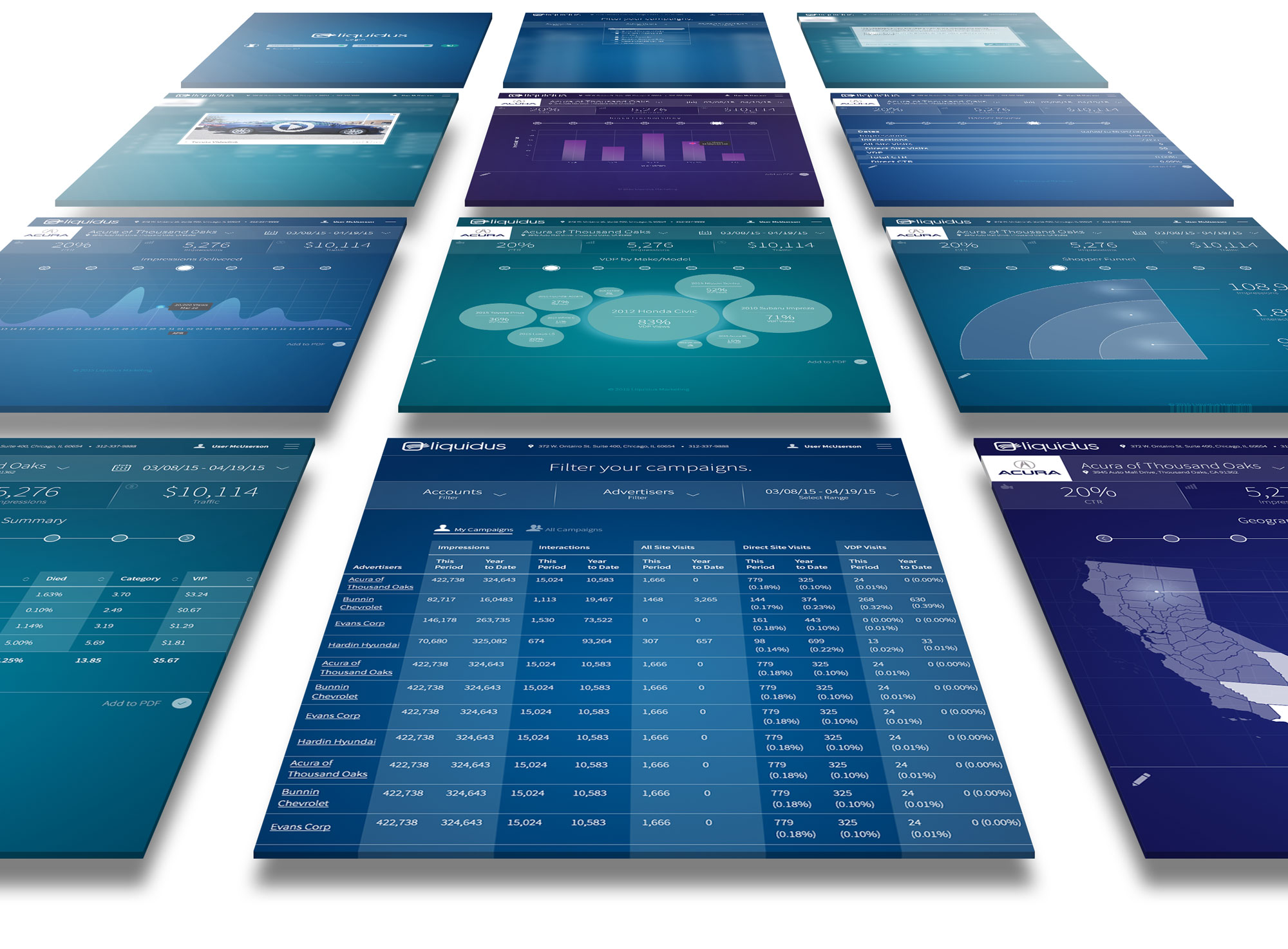
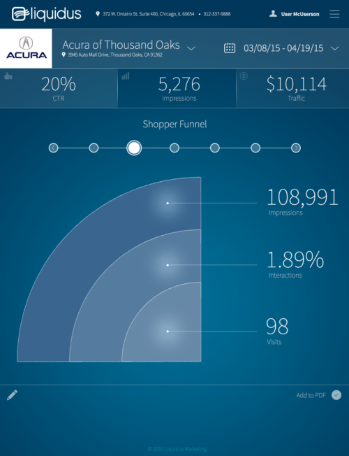
The Reporting Dashboard was a conceptual design so Account Managers and clients could login and view the status of their campaigns. When considering the UI, I tried to come up with compelling ways to show this information. I wanted it to stand out against dark backgrounds and frosted overlays.
The interface primairly requires the user to navigate left and right. As you move right, the screen turns darker and navigating left is the opposite. The home screen allows the user to filter their campaigns and progress into the dashboard mode.
Skills Involved
UI/UX Design, Graphic Design
Tools
Photoshop, Illustrator
When
May 2015
Follow the step by step interface below
Summary
Although Liquidus did not have the resources to complete the development of this dashboard, I am pleased with this conceptual design. Coming from a background of video and animation, it was one of the first product designs I had created in my career. I learned some basic tools and gained a general understanding of UX principles.


