

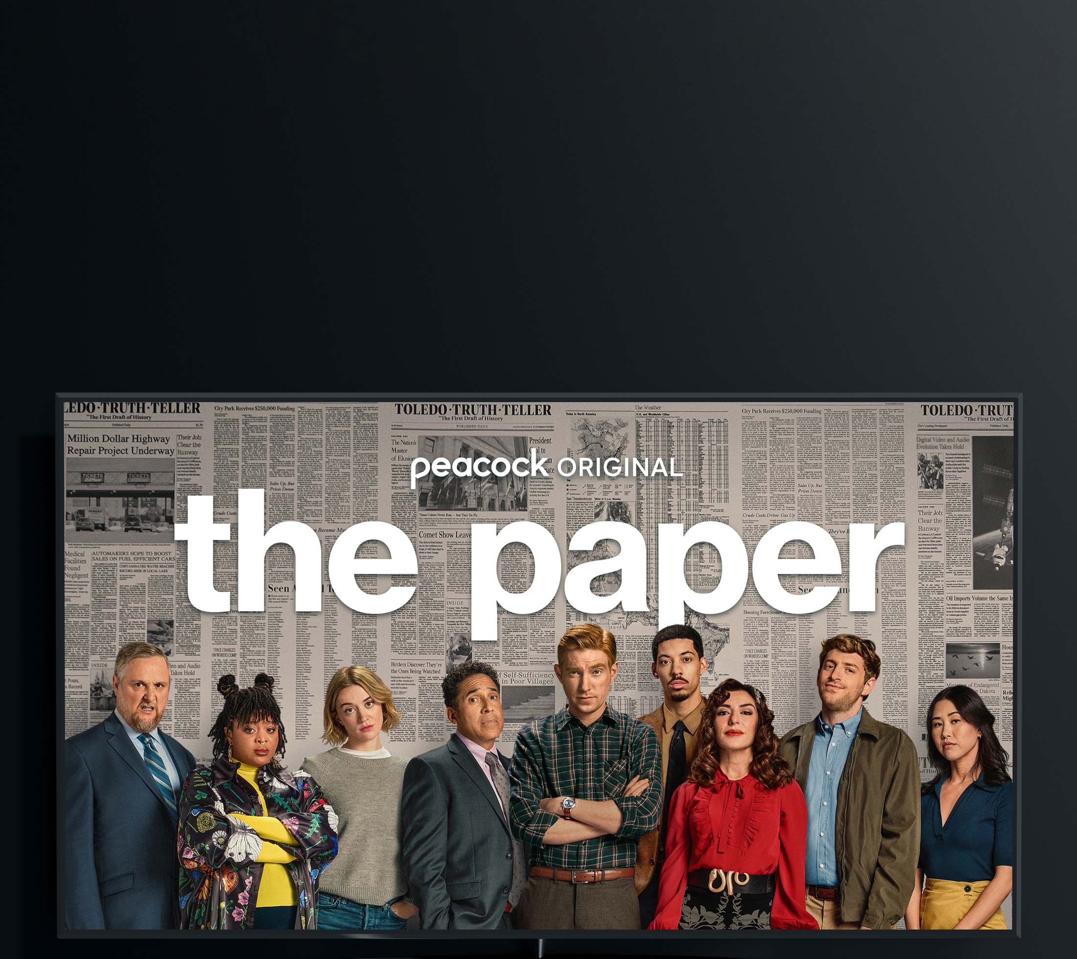
The Paper was a high-priority campaign for Peacock. Taking place in the world of Dunder Mifflin, and with Greg Daniels back at the helm as Producer/Creator, the goal was to give The Office fans a reason to subscribe to Peacock for more mockumentary comedy. The story follows a struggling Midwestern newspaper and the publisher trying to revive it with volunteer reporters (Domhnall Gleeson and Oscar Nuñez being the big star-sell).
While I was not involved in the early stages of this campaign, I made a significant dent in the creative for multiple media-buys. This was with the help of Art Machine. Mentality contractually handled all creative for the trailer itself but I was able to assist with title cards and the Peacock branding associated with the title. Most of the early stages of this production was shrouded in secrecy given its close connection to the original beloved series.
Skills Involved
OOH Motion Art Direction, Trailer Motion Art Direction
Agencies / Studios
Art Machine, Mentality, Deedle-Dee Productions, Peacock Creative (Internal)
When
July – September 2025
Hero Trailer
Due to the “Helvetica” like typography of the title treatment, Greg Daniels wanted the GFX cards to be relatively simple, with very little texture – like something you would see in a newspaper. Unlike other Peacock Originals, the title was not branded with the “original” eyebrow. This was because while it did initially stream exclusively on Peacock, it then moved to linear television (NBCU).
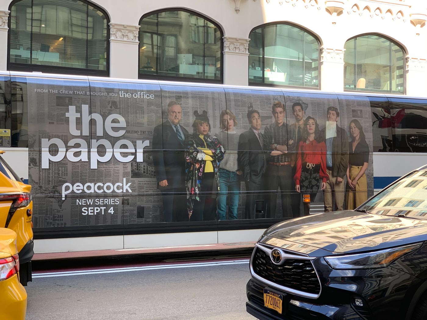
OUT OF HOME
Subway Triptych
I established the motion language of the “printing press” background,
revealing the key-art across all full motion digital boards below.
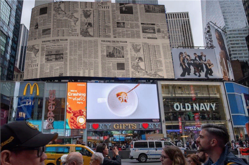
OUT OF HOME
Times Square
Greg Daniels and Deedle-Dee Productions wanted The Paper to stand on its own. So while we initially had messaging like “We’re not in Scranton anymore”, it was later changed to “Get ready for some good news”.
OUT OF HOME
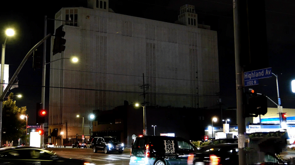
Iron Mountain – Projection
Iron Mountain was a new placement for Peacock. After doing some research I discovered a lot marketing agencies/studios would leverage the use of a black background, making whatever showed up on alpha pop out. If the team knew the media buy beforehand we may have been able to experiment with projection mapping.
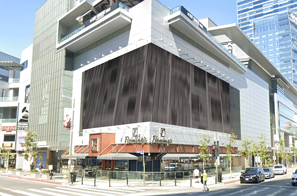
OUT OF HOME
LA Live
The boards at Olympic/Figueroa were recently switched from static to full motion digital. When determining art/copy placement we often have to take into consideration that this is a busy intersection and viewers may not see the “optimal viewpoint” as shown here.
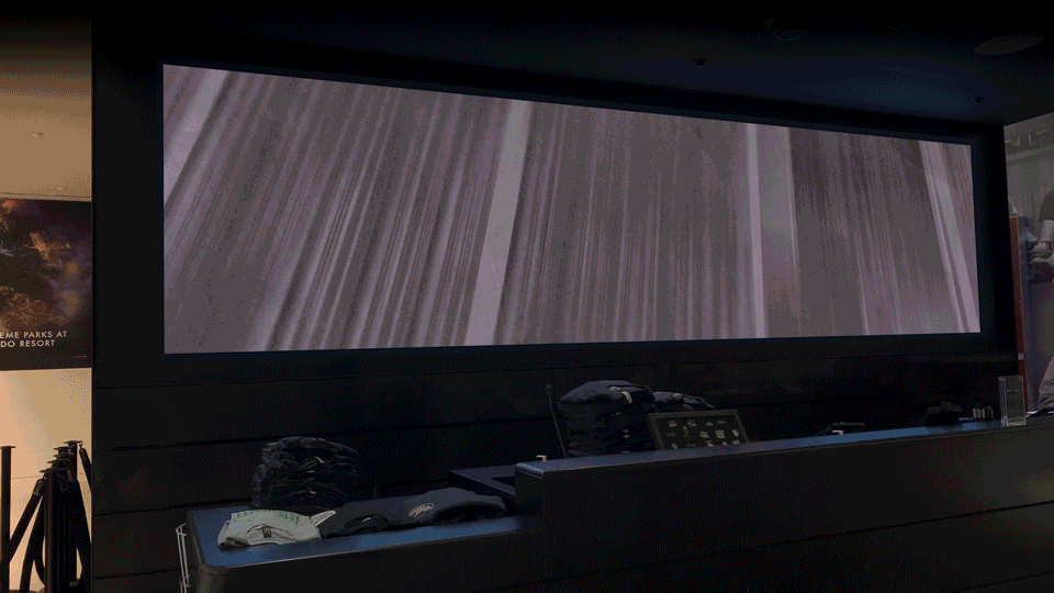
OUT OF HOME
NBC Store
After recently having a chance to work on The Office 20th Anniversary campaign, I was relatively familiar with this placement. We were able to repurpose the same design language as show above.
OUT OF HOME
The Sun Rose Hotel
OUT OF HOME
Peacock Place
LA Live (or Peacock Plaza) is a unique placement that showcases many interconnected oddly shaped screens, with audio, and a lot of foot traffic. I worked with Art Machine on this placement to create a :15 second cutdown, which then resolves to the hero key-art and character portraits across all 6 towers. We were aiming to get a slight “camera-shake/out-of-focus” effect on the art to replicate the documentary style.
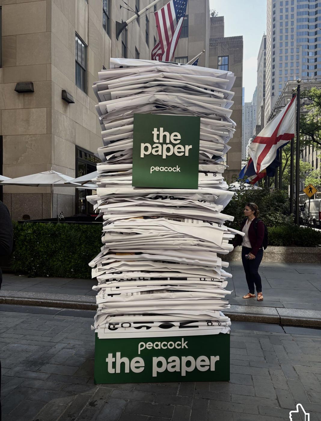
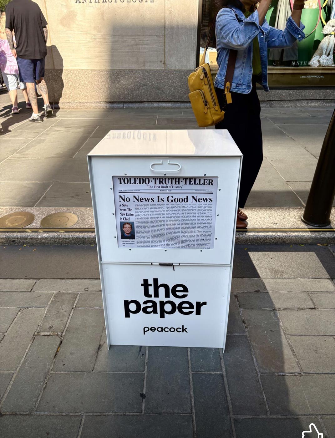
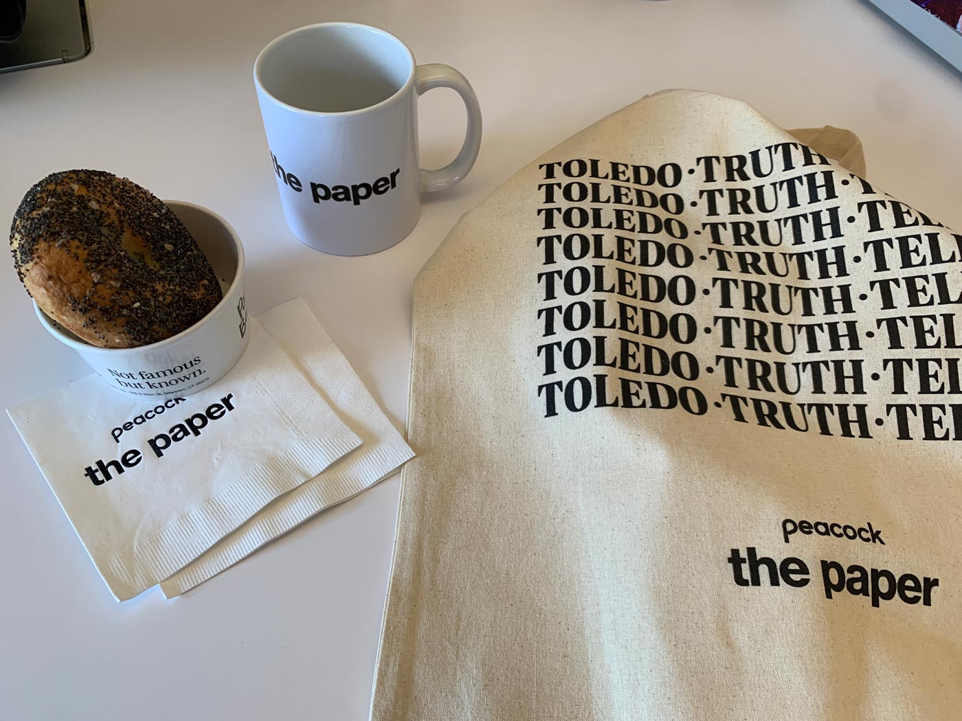
ACTIVATION
“The Paper” at 30 Rock
I did not play a role in the design of this activation but it was great to see everything came together in the end, in partnership with all the creative that had already been established for this campaign. Actors were hired to sit and read from the fictional newspaper the “Toledo Truth Teller” while Oscar Nunez and other talent made an appearance, handing out bagels and bags.


