
This title completed principal photography as a Universal Pictures film and later was distributed and marketed as a “Peacock Original”, streaming only on platform. Due to this cross collaboration between studios it was handled very similar to Genie, where Peacock played a game of telephone between the Universal and whatever vendor/agency they were working with. The Killer is a reboot of John Woo’s 1989 film (under the same name). It follows a contract killer, from Paris, who refuses to murder a young blind woman on the orders of her handler, and finds herself hunted by old colleagues and a determined detective.
My involvement with this campaign leaned more towards the art direction of the key art, as well as trailer GFX (which had already been created), and finding a way to bring this all together for OOH and digital placements. We had to find a way to make the design feel cohesive and create key art using the limited assets available, while appeasing executives, producers, studio heads, and John Woo. The agencies/studios involved were plentiful, including AV Print (Art), Inside Job (AV cutdowns), Aspect (AV), Universal Pictures (communication with vendors), Art Machine/Trailer Park (versioning static), and Englewood Cliffs (versioning AV).
Skills Involved
Key Art Art Direction, Trailer GFX Art Direction, OOH Art Direction and Design, Versioning
Agencies / Studios
AV Print, Inside Job, Aspect, Universal Pictures, Art Machine/Trailer Park, Englewood Cliffs
When
May – August 2024
Hero Trailer + Spots
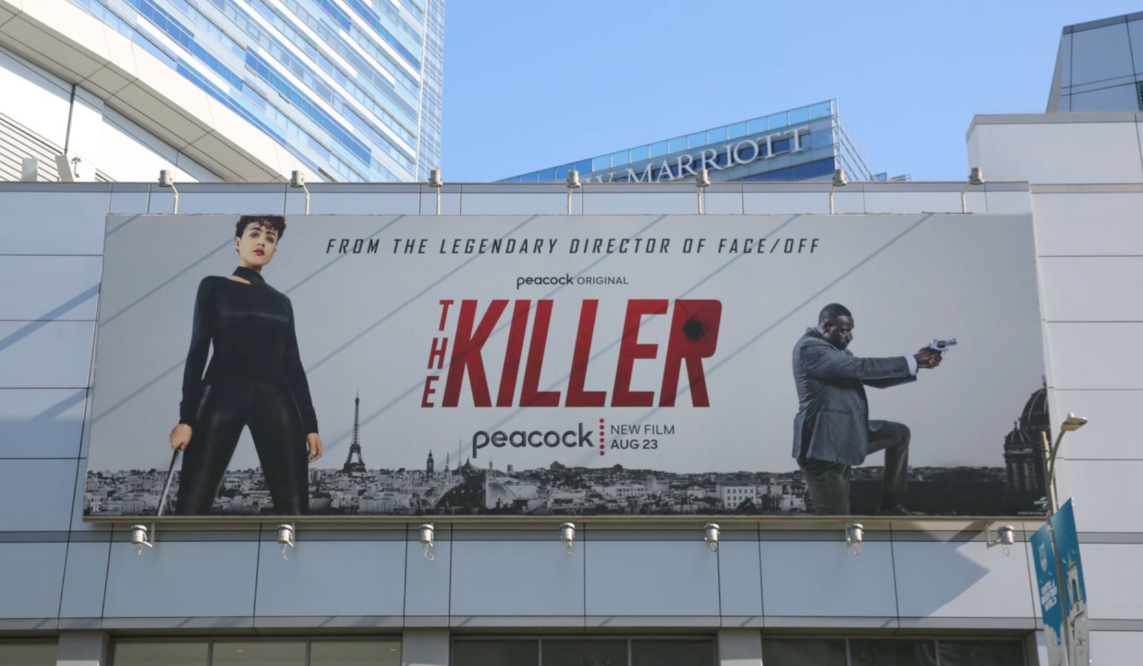
Because this was John Woo’s re-imagination of his original 1989 film – with no real big names as leads (aside from perhaps Sam Worthington), we leaned into the “John Woo” pedigree, while also including “From The Legendary Director of Face/Off” on the art. The challenge here was Universal (who had been working with Aspect) had already signed off on the GFX for the hero trailer – yellow text on a black background – while we were just starting to design the key-art. Through many rounds of revisions, the art ended up having a very different look and feel, and it was too late to make adjustments at this point until Peacock started to version out bespoke placements for OOH.
Title
:30 Spot
Tools
After Effects
Summary
Inside Job really helped the Peacock team edit some of these cutdowns (especially considering their heavy workload at the time). Contractually, when the Face-Off accolade wasn’t mentioned in an internal card, the title card must read “John Woo’s The Killer”, along with the billing, etc. I created all the GFX toolkits with appropriate Peacock branding.
Title
:15 Spot
Tools
After Effects
Summary
Some of these sonic based cutdowns were nicely constructed, which read more like a teaser. Peacock branding rules required all :15 spots end with a Hybrid Endcard – which means the What, Where, and When all exist on one card. Often times this can be difficult to digest as a viewer.
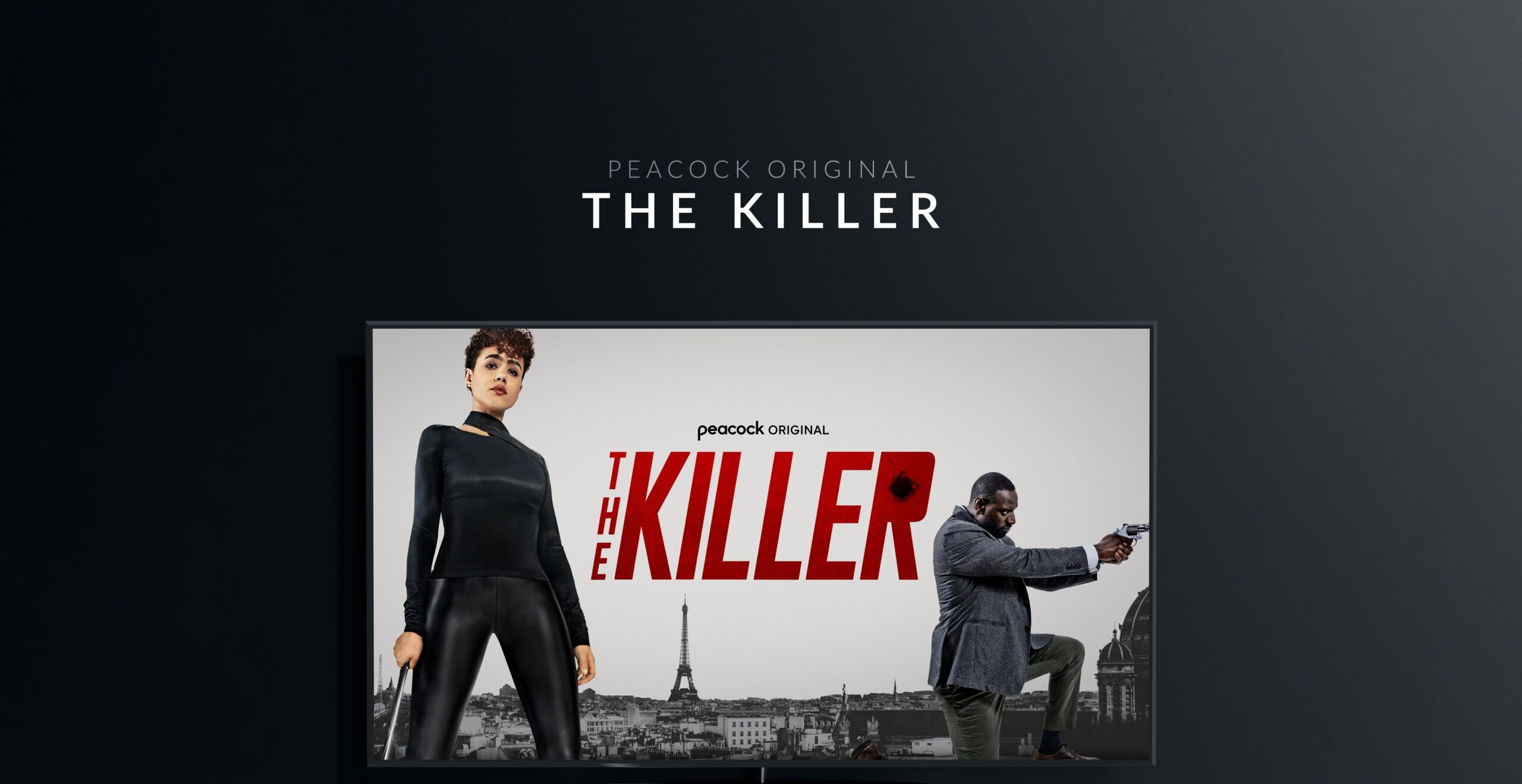
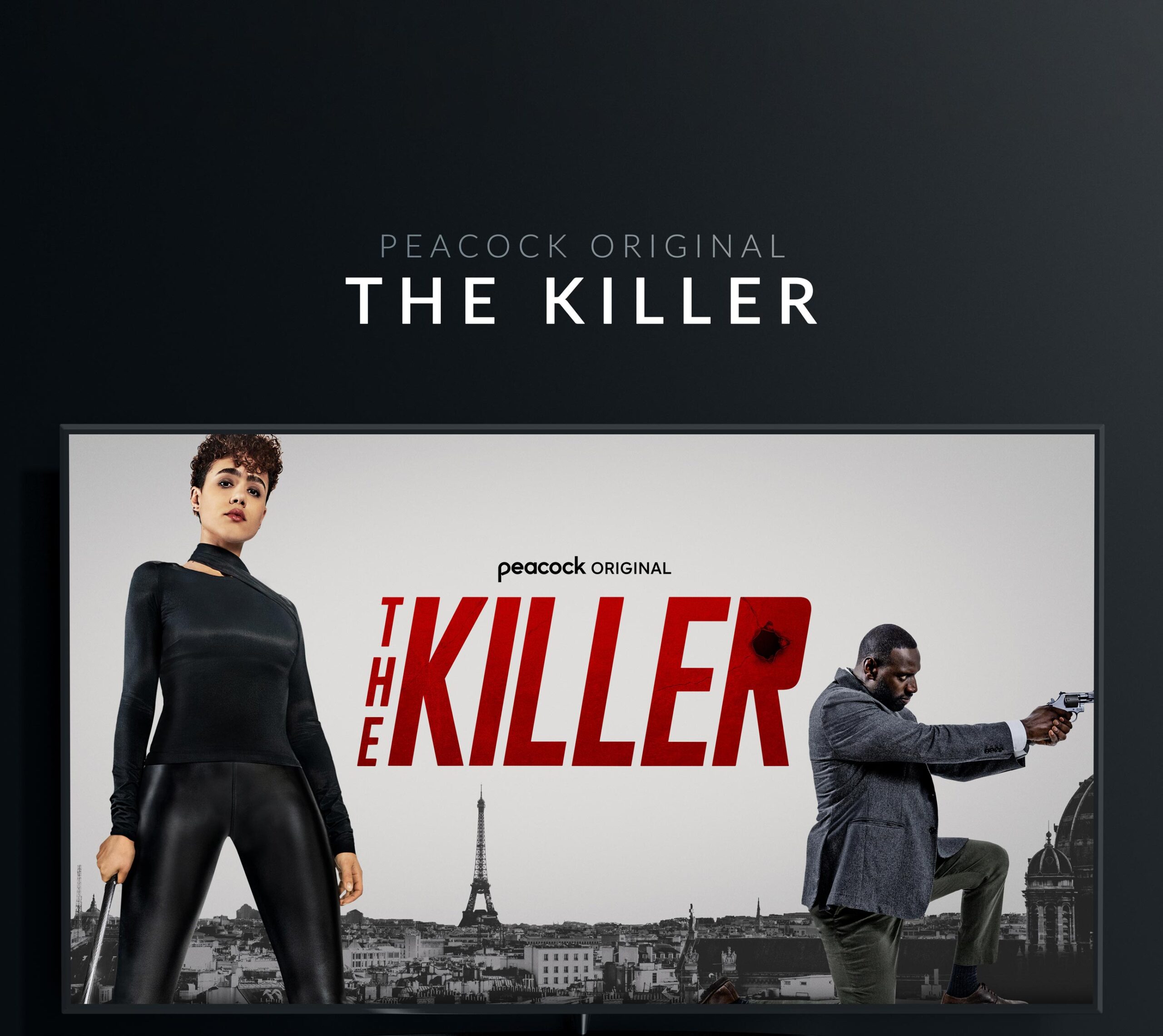
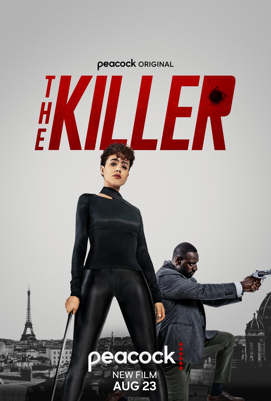
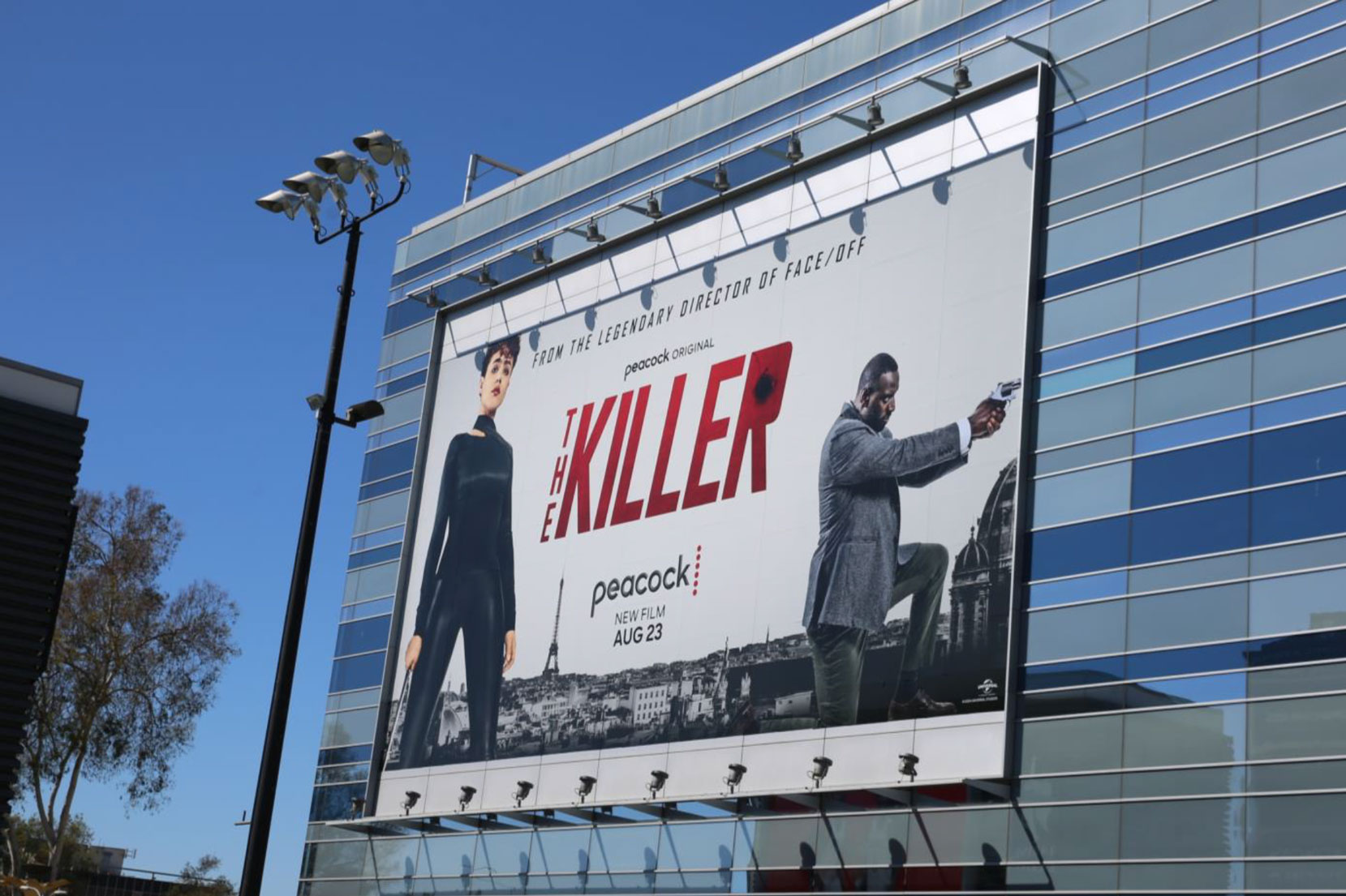
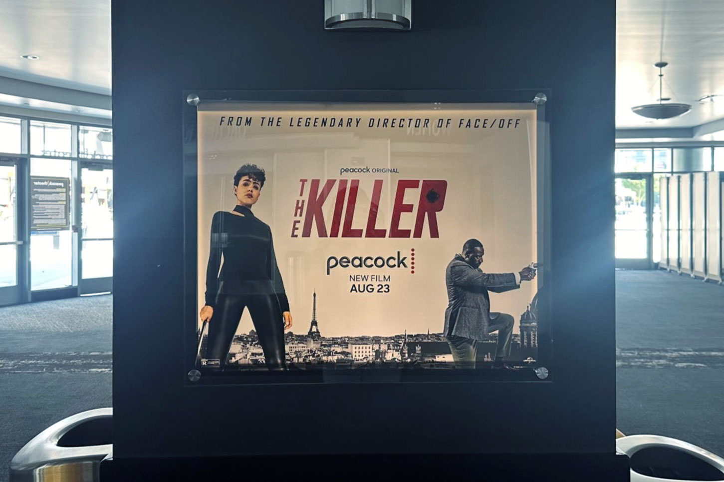
Key Art
As mentioned above, Peacock started to provide art direction on the key art after production for the film had completed. Although a shoot did take place, our design team wasn’t able to provide sketches and ideate on different concepts prior. Therefore we were somewhat restrained to work with Universal who then communicated with AV Print who applied our feedback, sent the comps back to Universal, who then sent the revisions back to our team for executive approval.
We ideally wanted the art to match the already approved style of the trailer, but after several rounds of feedback, executives and team were leaning away from the “grunge” textures. It wasn’t until later in the process that we learned Omar Sy had only approved a few select poses from the shoot (on his knee holding a gun was one of them). This limited our options quite a bit and we pivoted for a more simplified direction. Additionally, executives and design directors are often thinking about what will read best as an on-platform thumbnail versus a large poster.
Fortunately, in the end the white/gray backdrop of Paris with a bright red title was very eye catching. In a world of busy advertisements competing for your attention, the simplified design really caught your eye. However, Omar’s stance holding a gun (which was the only one approved for use) later proved problematic as some of our media partners (most notably Apple) will not allow a gun to be present on the art. This was something we addressed later down the road.
HERO ART

CINEMAGRAPH
OUT OF HOME
Character Portraits
Working closely with Art Machine we juggled between multiple stances for Omar Sy. We ideally wanted all talent to match in height and we were lucky to get talent approval to do so. Sam Worthington however was not part of the initial shoot so we had to sift through unit photography, stylize, and blow up the image to match Nathalie and Omar. All things considered, this film had a surprising number of media buys.

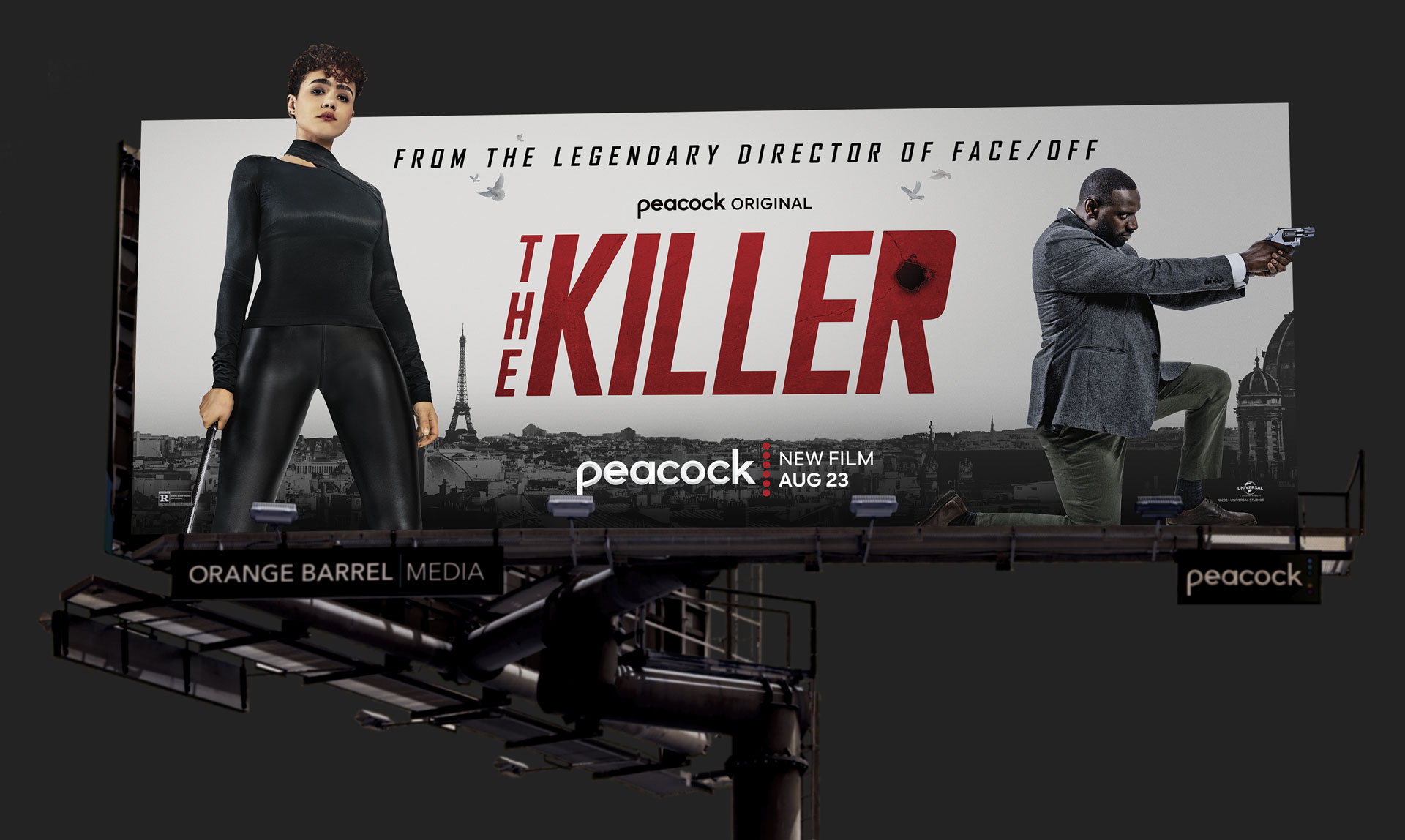
OUT OF HOME
Sunset Boulevard
This was an eye catching board. Working with Orange Barrel Media we were able to add extensions that really made the talent pop. If you’re familiar with John Woo’s films, he’s known for using doves in action sequences (seen in the trailer above). This was a subtle detail that we included on all static art and animated cinema-graphs.
OUT OF HOME
LA Live – Plaza
LA Live (or Peacock Plaza) is a unique placement that showcases many interconnected oddly shaped screens, with audio, and a lot of foot traffic. However, when visiting the plaza in person, it’s often questionable whether a viewer can really take in the entire space as one unit or if it appears segmented – similar to something you’d find in Times Square or Las Vegas. Sometimes the audio may be muted completely. With this in mind, I typically direct vendors to focus on a sonic based edit that resolves to a cinemagraph of the key art.
This cutdown in particular was one of my favorites. It really builds with excitement, and because it’s a :30 you have enough time to read the final messaging. Notably, we had time to match the internal GFX cards with the final key art – without having to get additional studio approval. This helped keep things consistent and clean.
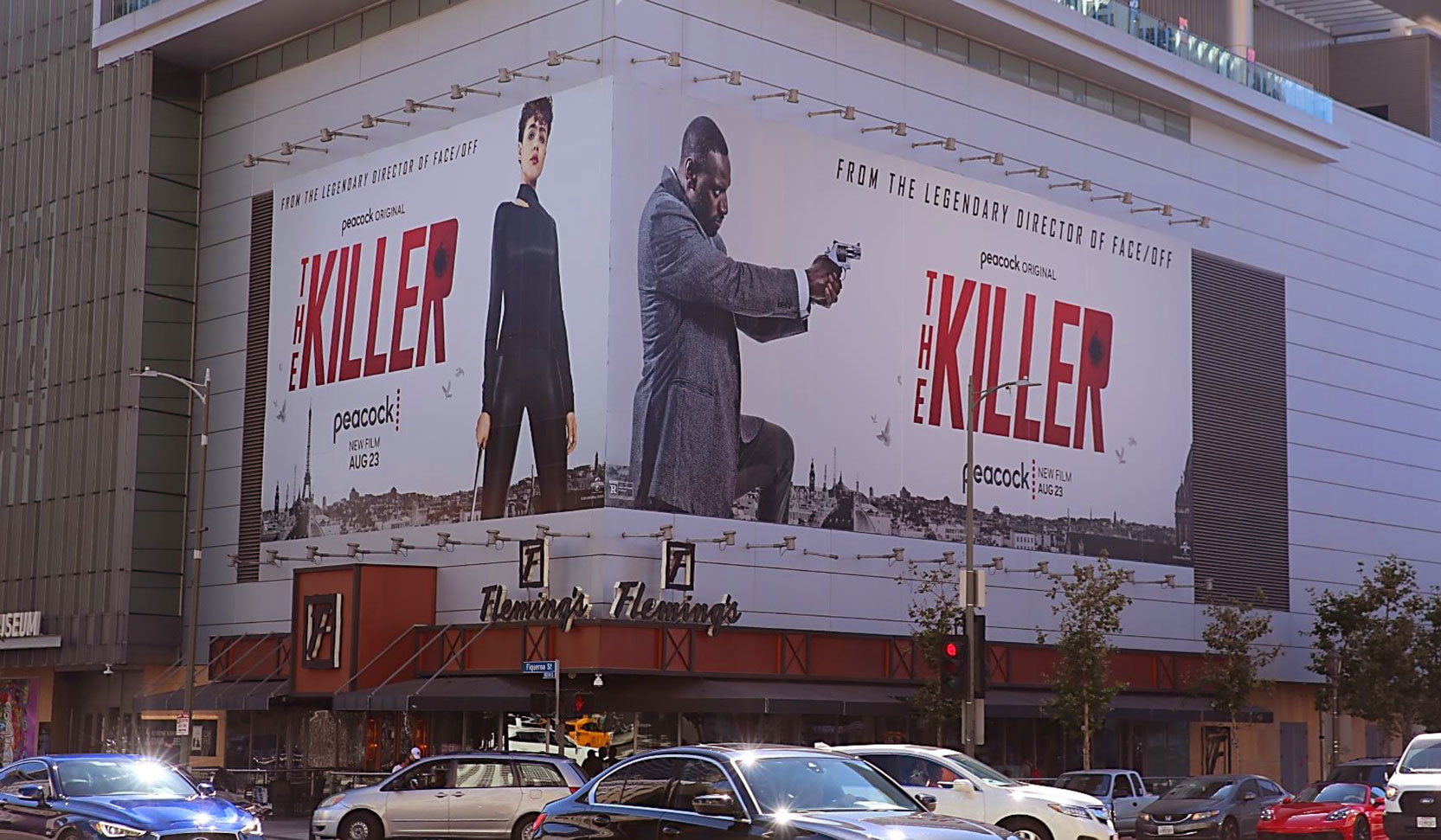
OUT OF HOME
LA Live – Static
Art Machine played a role in versioning out different static placements across LA Live. “From The Legendary Director Of Face-Off” was contractually required on all OOH placements, and as mentioned above, we were only able to use the single approved stance for all talent.


OUT OF HOME
Times Square
Similar to LA Live, this :15 second cutdown has no lip flap (since there’s no audio in Times Square). I made sure the internal cards matched the white/red design of the key-art.
DIGITAL
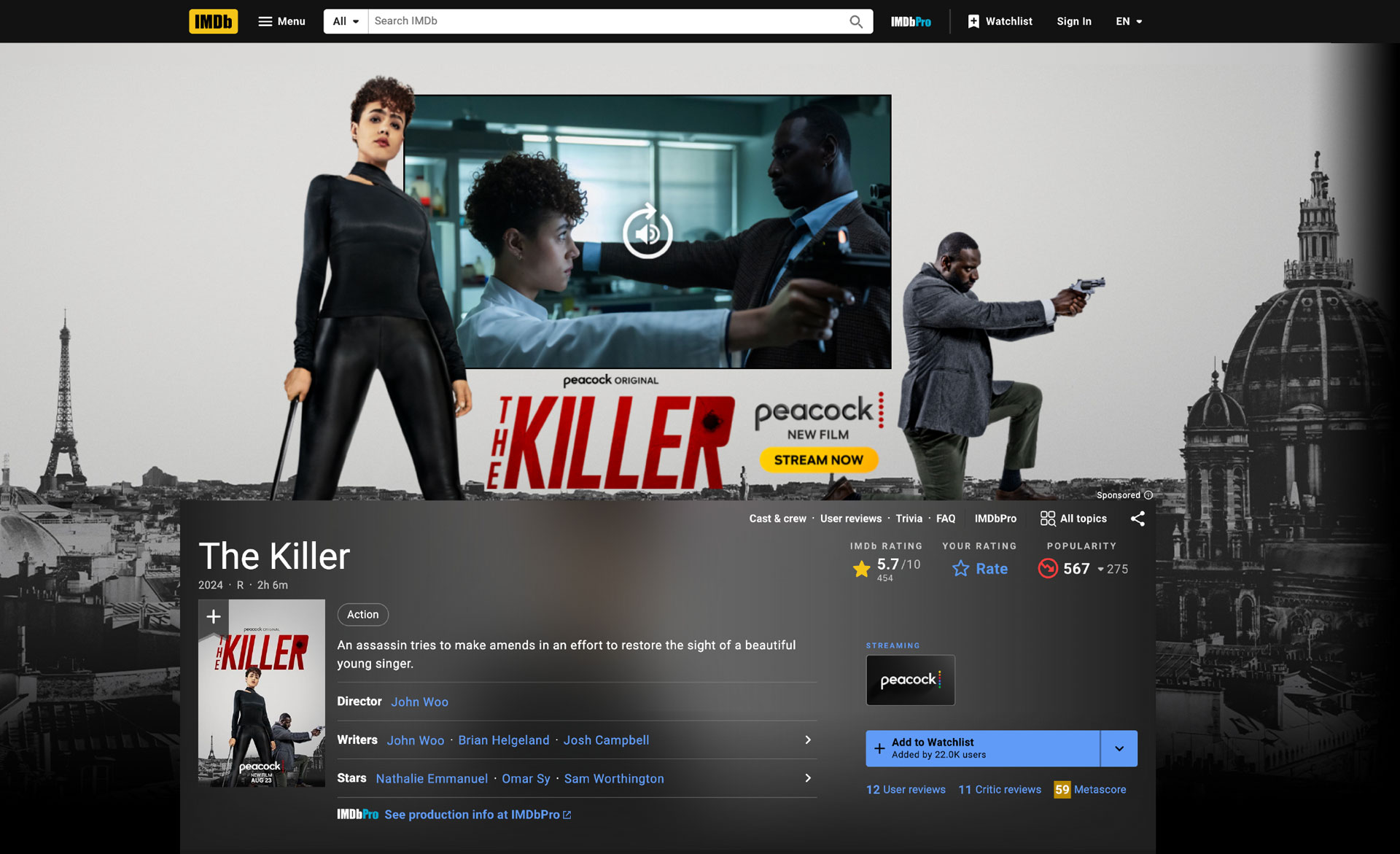
IMDB Takeover
As with most campaigns, we frequently work with partners (such as Roku, IMDB, IGN, the list goes on) to create a full page takeover. Because we didn’t have a custom shoot, we utilized the backdrop and talent to create an interactive experience in-front and behind the video player. Something to note: there’s only one Eiffel Tower across all placements.