
Due to the Anthony Mackie’s connection with the fan favorite series “Twisted Metal”, this indie film was thrown at the films team with only 2 weeks to launch as a Peacock Original. Production had completed so we only were able to leverage unit photography or up-res screen-grabs for the key art, and a scene pull or quick edit for the trailer.
While this was no blockbuster film, it was impressive that we were able to work with agencies and creative directors to create the art, edit the trailer, get talent and director approval, go into finishing, and version it out for all partners and platforms, all within 2 weeks time. I worked closely with Art Machine/Trailer Park to help find potential scene pulls and stills, while also art directing the title treatment that was used on the art, making sure it felt cohesive with the internal title cards used in the trailer.
Skills Involved
Key Art Art Direction, Trailer GFX Art Direction
Agencies / Studios
Art Machine/Trailer Park, Peacock Creative (Internal), Storm City Films
When
October 2023
Hero Trailer + Scene Pull
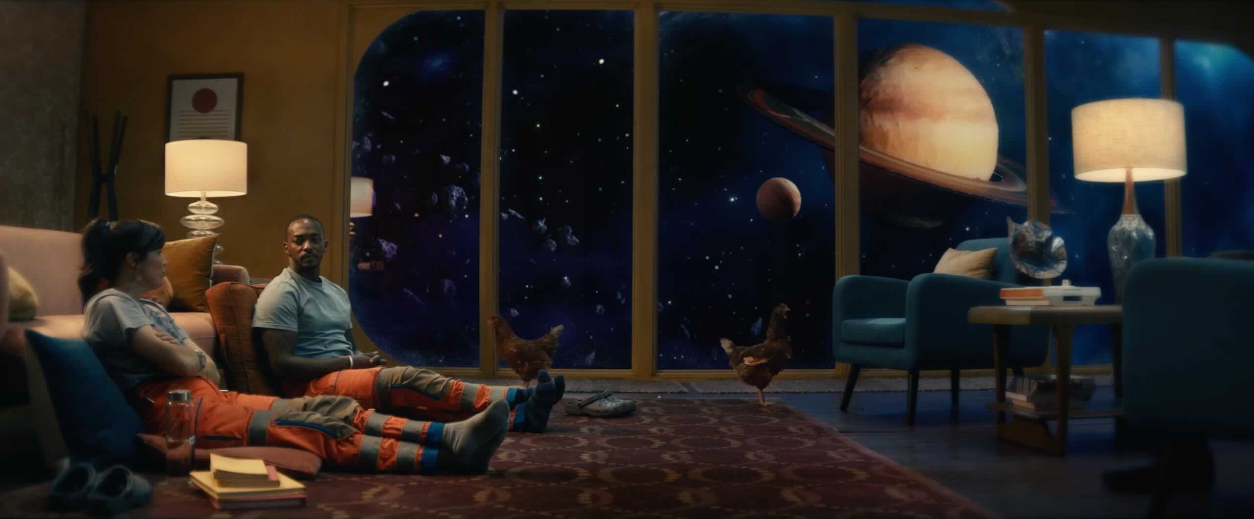
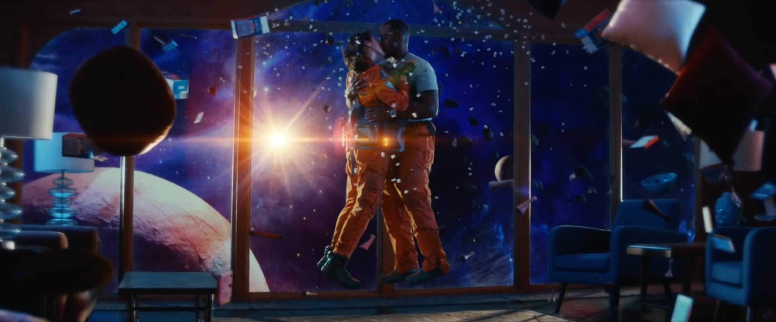
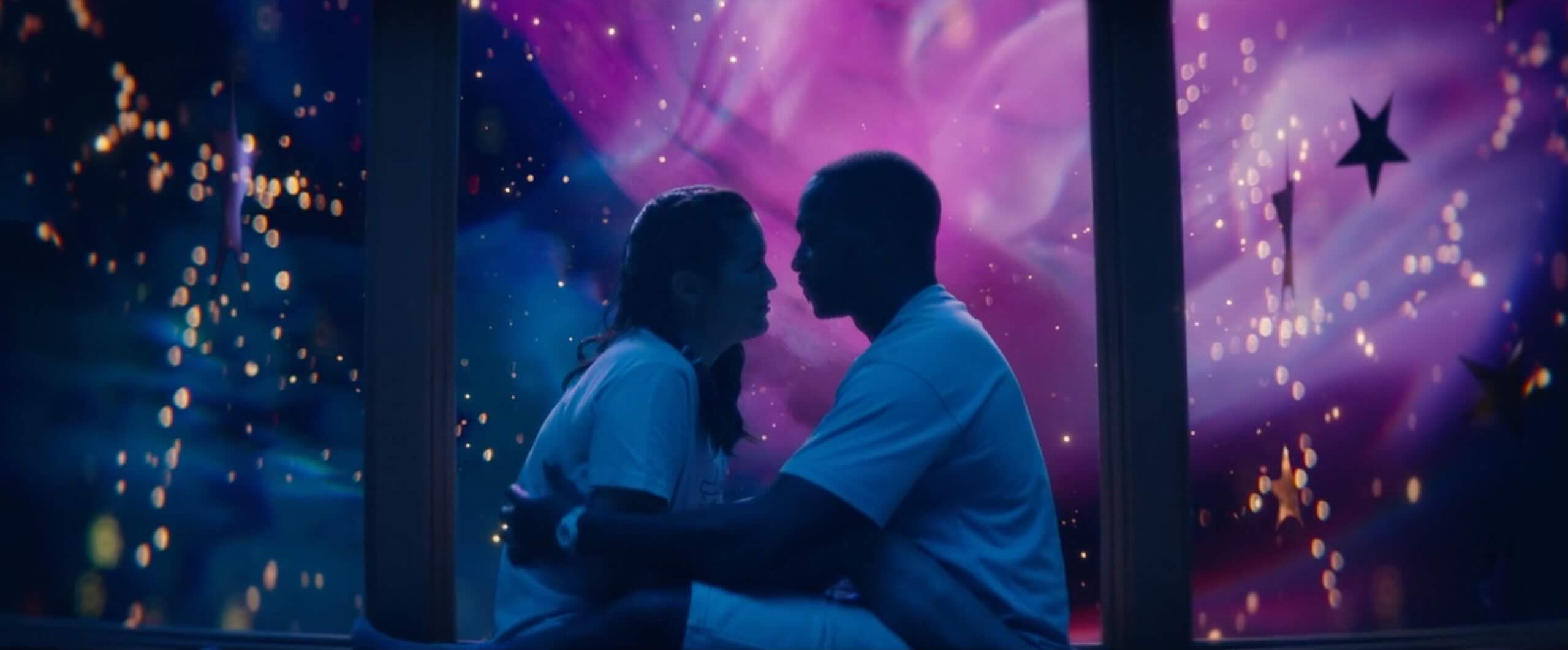
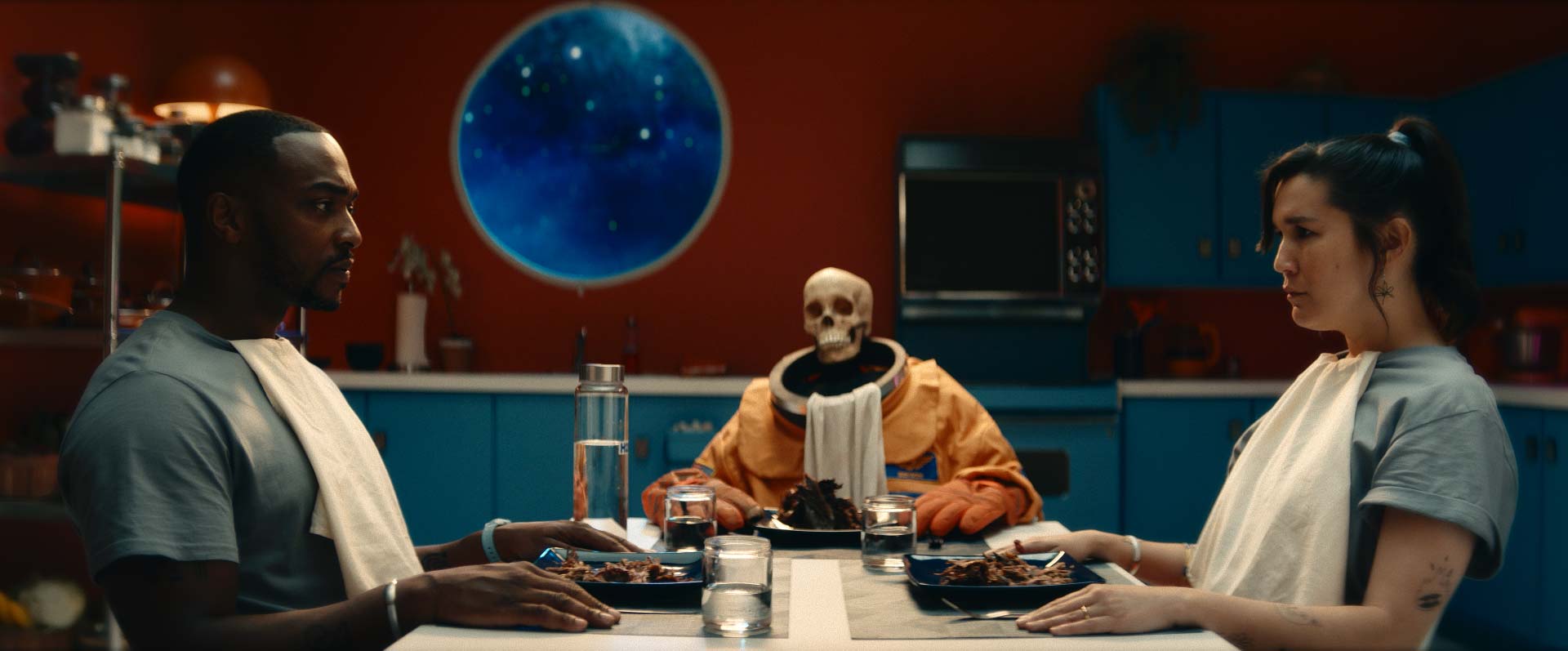
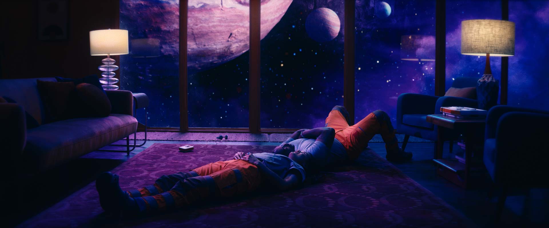
Coming out the SXSW Festival, this film has an intentional “indie” feel that was not meant to be taken seriously (the papier-mâché outer space environment is a good example). The full trailer leveraged raves, while the :30 second cutdown was a scene pull.
Title
:30 Spot
Tools
Premiere Editing (reference), Title GFX Design, Art Direction
Summary
This is a relatively simple scene pull that best represents the inherent dilemma the two leading characters are in: astronauts stuck in space. Given the two week timeline, we only really had time to pull together a title card, thanks to the help of Art Machine/Trailer Park.
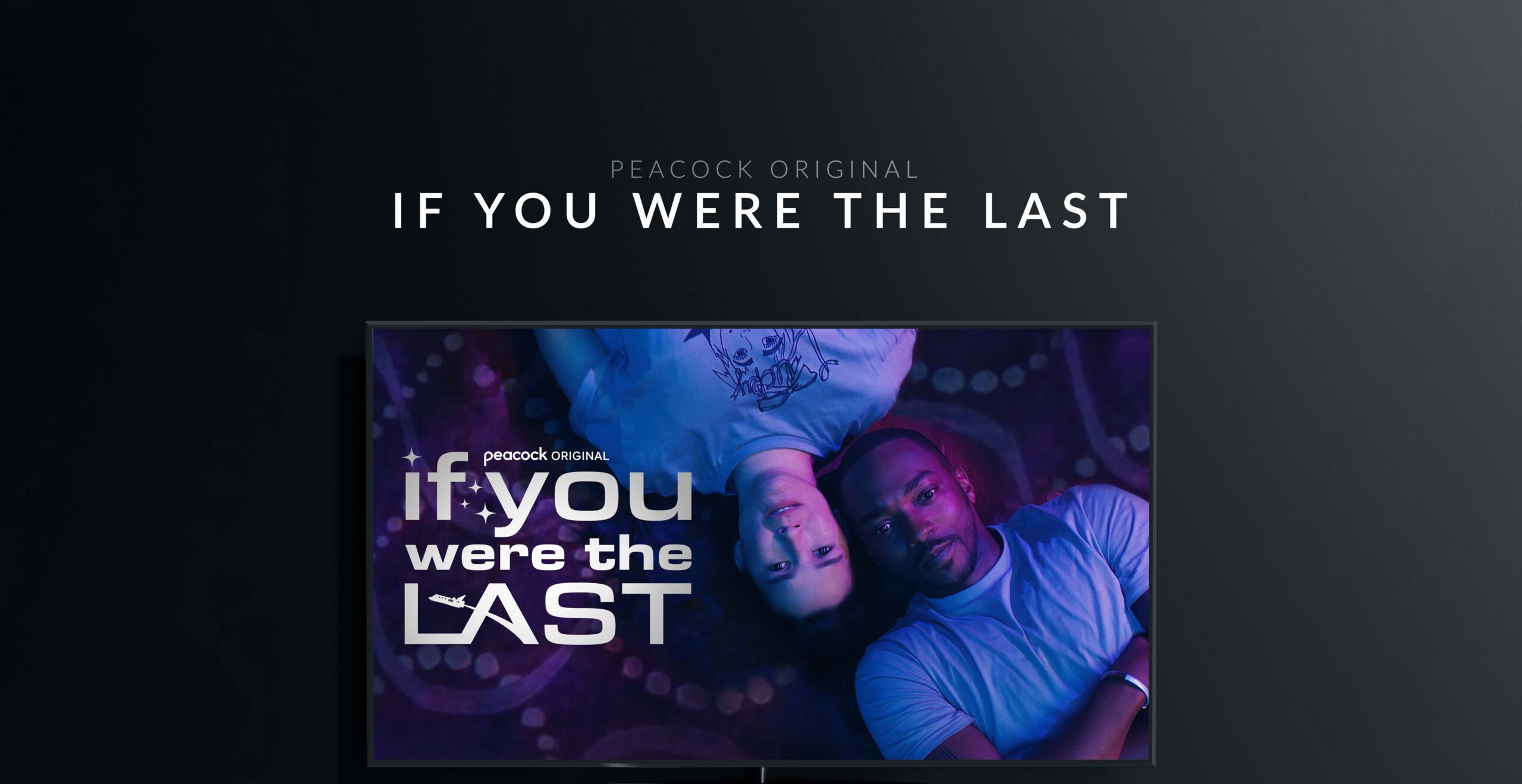
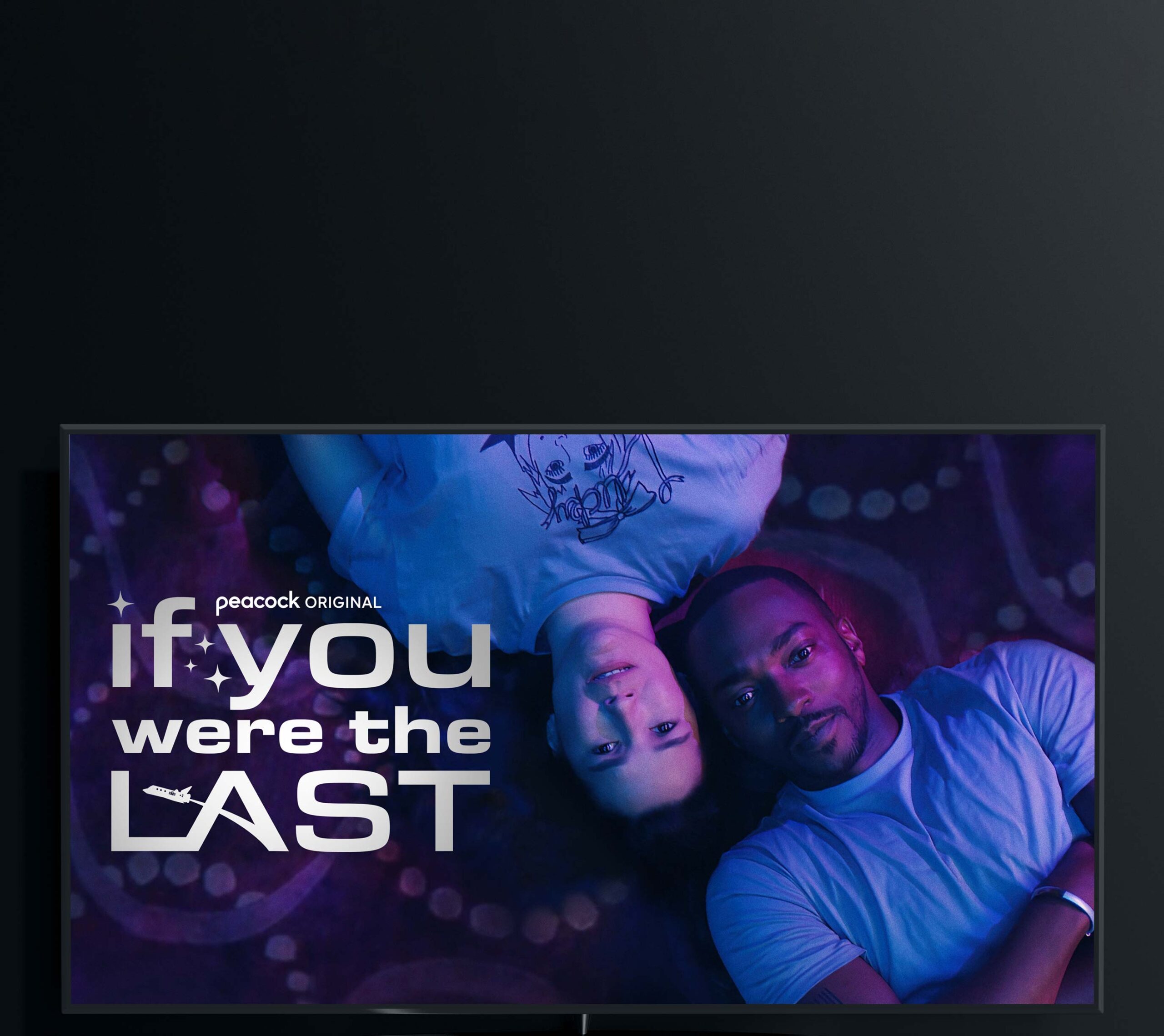
Key Art

CLICK FOR POSTER
STATICS
Thumbnail Explore
Below are different scene pulls and various talent approved unit photography that we considered for the key art or on-platform thumbnail. The film frequently utilized a purple color palette that lead to the final hero art, with orange accents. The title treatment stems from a similar vintage “NASA” font, alongside fun accents. The final full bleed had to be extended for larger placements and potential OOH media buys.


