
From UI to micro-interactions, the design is in the details.

CMP (Content Management Platform) is a product that I designed to be used internally by Account Managers and Media Managers at Liquidus Marketing. It allows these team members to view the results of currently running campaigns, flights, and accounts and adjust them accordingly through a series of notifications and alerts. I am responsible for skinning the entire UX Prototype with my UI design, page by page.
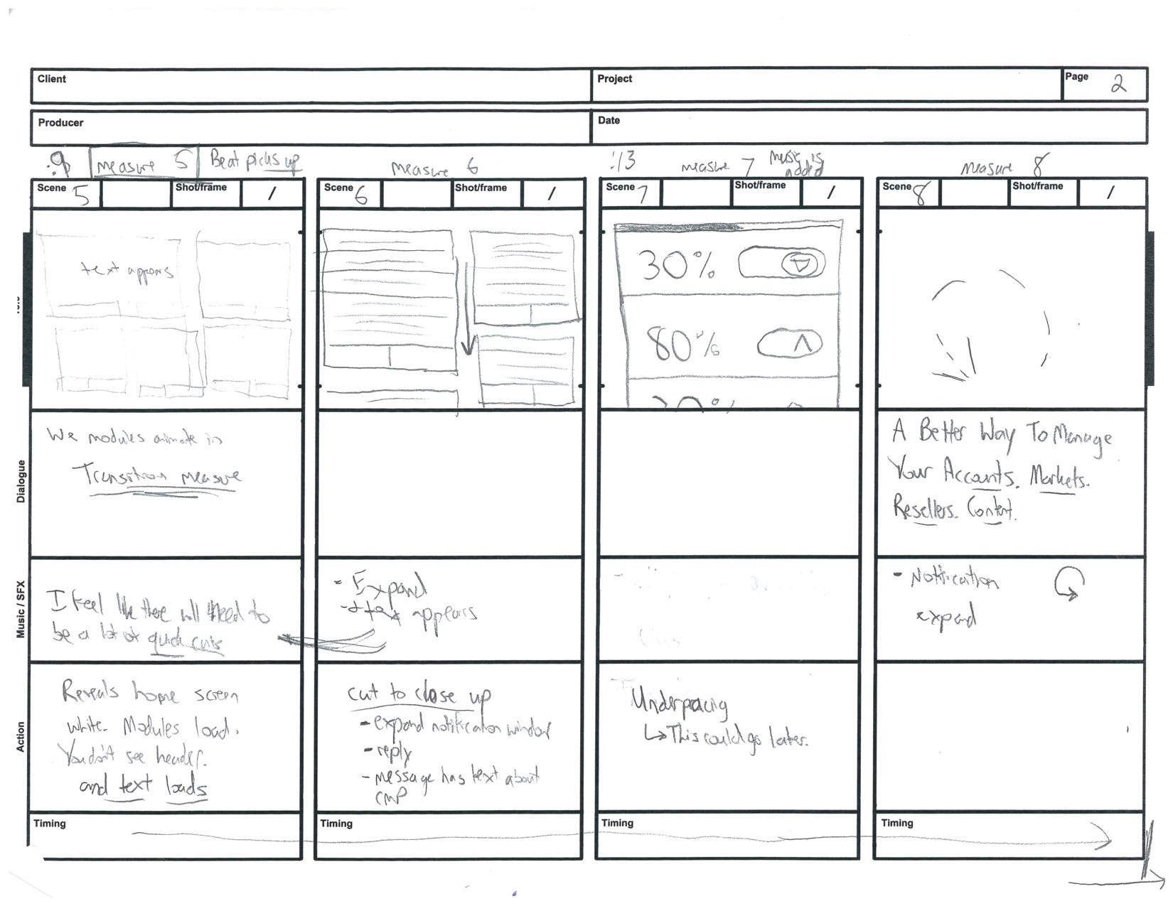
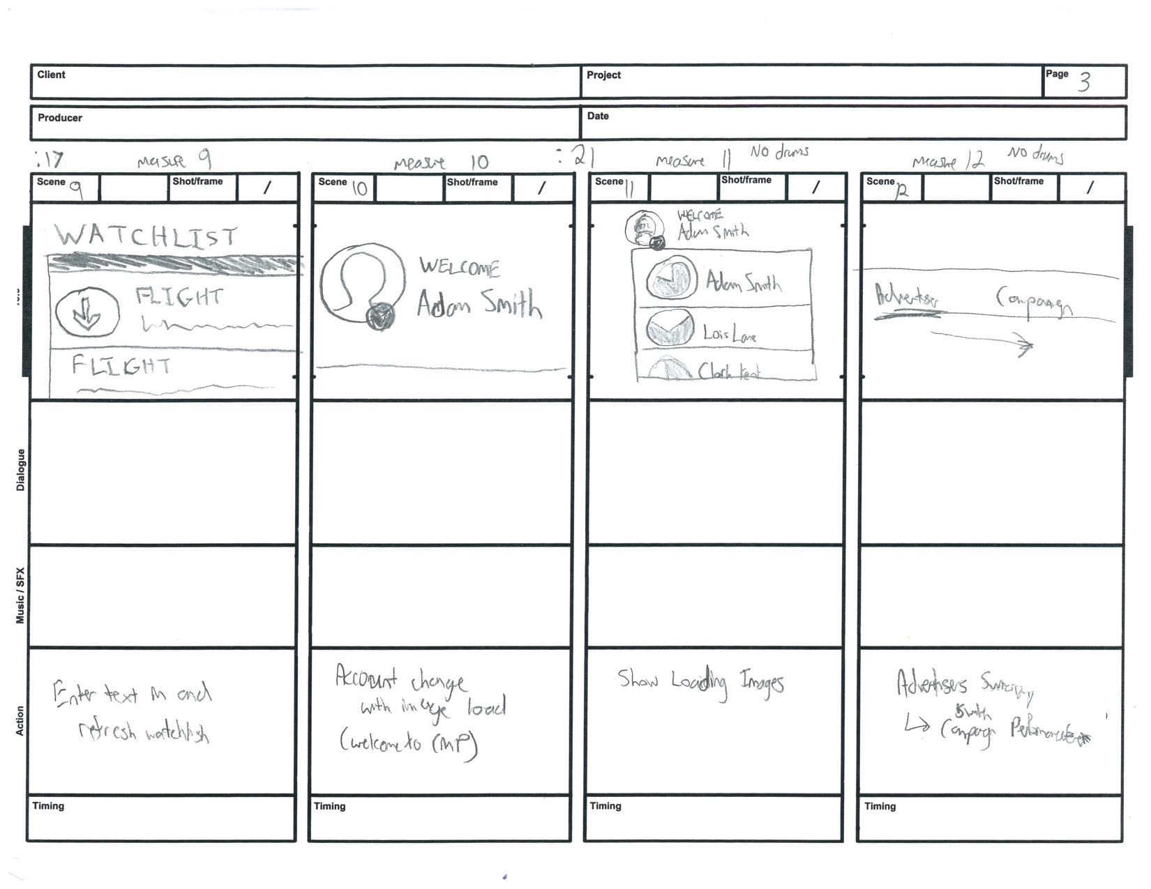
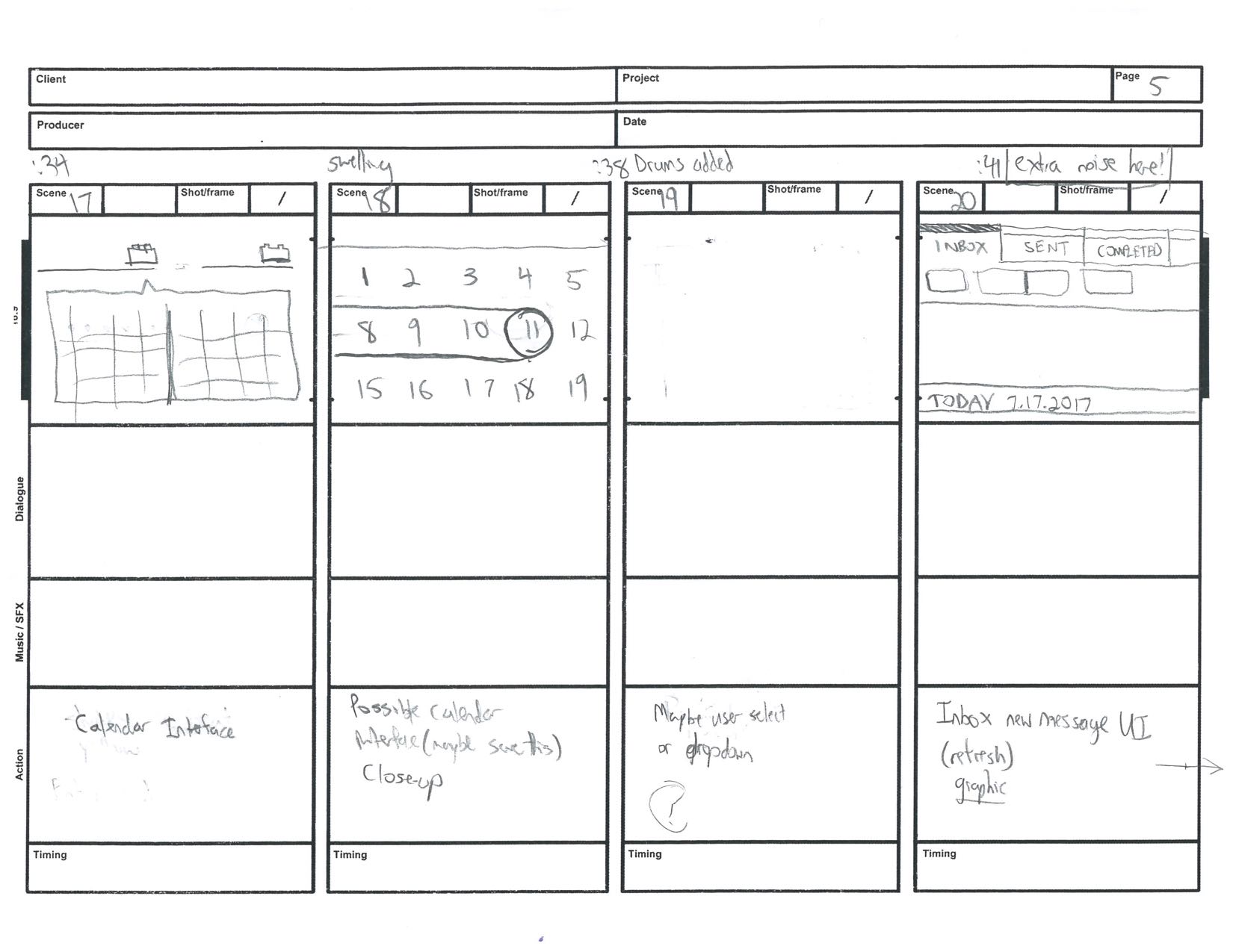
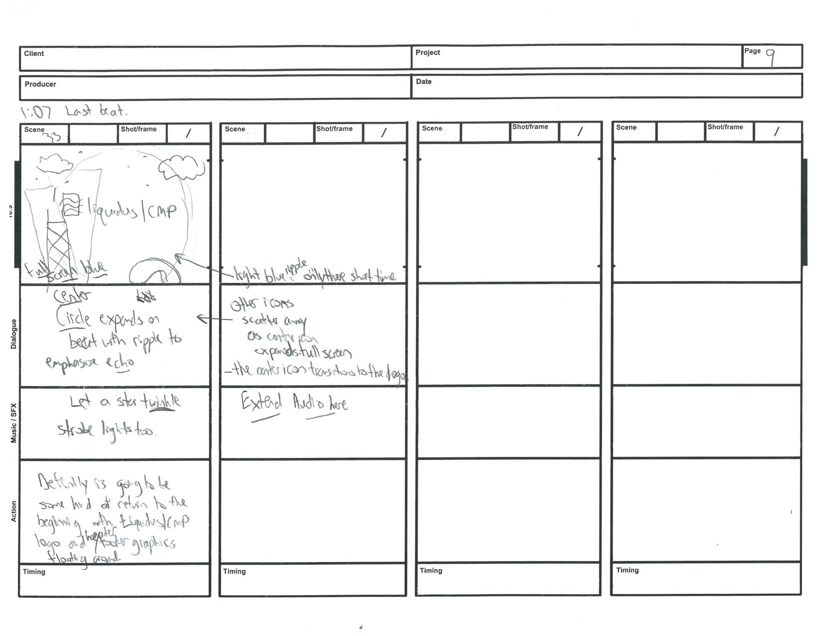
My process includes doing a fair amount of research of current trends, user testing, and collaborating with developers to understand what is possible and what is not. I was so inspired while designing the UI, I wanted to produce a video that helped the developers envision the micro-interactions of the interface. What started out as a few animations turned into an entire product video for Liquidus | CMP. The result is below (60fps).
Skills Involved
UX/UI Design, Interactive Product Design, Motion Graphics Animation, Sound Editing/Mixing
Tools
Axure, Illustrator, Photoshop, After Effects, Premiere, GarageBand
WHEN
December 2016 – June 2017


Login & Home Page
The homepage introduces a dashboard, separating content out into a series of buckets, or as I like to call them “Display Boxes.” Display Boxes are a key element to CMP, as the user will find them consistently across the entire platform. Each Display Box has an interactive click state – causing a blue bar to move across the top and the typeface to change weight. Another key element to the Home Page is the ability for any user to switch accounts without having to log out, with ease.
As a whole, I tried to design the UI for CMP to be minimalistic and clean – with careful attention to how colors, iconography, and typography interact with other elements on the page. For example, the general notification drop shadow emulates that of Apple Music album art work because the shadow itself pulls the green color from the notification panel. The footer/header illustrative iconography is inspired by Dropbox and designed to make an emotional connection with its users and its association with Chicago.


Flight Detail
Next to the Home Page, Flight Detail is probably one the most frequently visited pages users visit. Following the same guidelines, Display Boxes encompass all content. Probably one of the most memorable elements on this page is the Accordion Toggle which gives the user the ability to Hide/Reveal Flight Stats. Coming from a background in motion graphics animation, this was one of the first micro-interactions that inspired me to make the video.

Fonts & Colors
The struggle here was trying to stay true to Liquidus branding while also introducing new colors to the evolving UI kit. Considering that interactive design is an ever changing organism, it was time to introduce gradients other relevant colors to the platform style guide to stay relevant and up to date.


Campaign Performance
The prototype spread all this information out into several charts but I was requested to consolidate all the data into one Graph/Chart. I wanted to callback some of the gradient elements I used in the header to really make the content stand out. I believe in making the user follow as few number of steps as possible, so by combining the Chart Key with the ability to select/deselect Flights displayed on the chart itself, it serves two purposes.

Inbox
The CMP Inbox allows a user to respond/address a Notification or Alert they may have received associated with a Flight. Once the Notification/Alert has been viewed, they have the option to respond and indicate whether an action has been taken or not taken. This went through many variations to discover which design might work best for Account/Media Managers and what elements serve as the priority when receiving a message (the name of the person/system sending the message or the notification/alert?). I am happy with the result. I also added a hover and click state.


Drag And Drop Ordering
As part of the Report Builder users needed a way to prioritize/organize how the Dimensions would appear on the final Excel Document. After doing extensive user testing and UX/UI design I came up with this final solution. My design inspiration came from a combination of the WordPress drag & drop portfolio builder and as you can see from the animation, I use Google Material Design touch masks – which I continue to use throughout the video.

Advertiser List
Advertiser List is a Column View that narrows down the user’s search from Reseller, Market, Advertiser, to Flight. Because there is so much empty white space as the user moves across, my solution was to design additional illustrative iconography that matches the header/footer. Again, similar to the Inbox, I am using the same hover and click states. Each panel slides out when a new section is selected, as shown in the video above.


Reporting Date Picker
I did a fair amount of research before designing the date picker for this Report Builder. Without much thought, I feel like I have seen a lot of designers/developers quickly choose a standard calendar interface that puts the user through an unnecessary number of steps. Using the minimalistic design, I wanted to put the weight on the developers and through a few hover states and click states I designed an intuitive way to select a start and end date.

Iconography
CMP (Content Management Platform) is primarily intended for users to view/manage the status of currently running campaigns, flights, markets, and advertisers. The Notification Center combines everything the user needs to be aware of in one place. I was tasked to design 14 custom Notification Icons and 5 Alert Icons that refer to different tasks assigned by either other users or the system itself.
UI Elements
To properly document the UI and visual design of CMP for the developers I created a style guide that identified all the elements and rules, not just of the static Illustrator graphics but animations as well. This is a small piece of that. I designed a font library which contains all the SVG iconography to better assist with the development process so that in the future if any scaling or colors needed to the adjusted, it can be done with ease.


Admin
General Notification
The first section of the Admin includes the ability to create a General Notification that can be found right below the Header on the homepage. I like to use less text/explanations and more color association to indicate a message to the user. For example, across the platform the green dot universally means good, the yellow dot universally means a call for attention. In this case the green dot means Active, Yellow means Inactive.
Admin
Assign Accounts
The second section of the Admin page gives the ability to assign team members to different resellers and markets. When a Team Member is selected on the left, the corresponding Media or Account drop down is highlighted. The user knows they can now assign this selected Media or Account Manager to any one of these drop downs. Once an edit has been made, the number in the circle (Markets/Flights) updates below the user icon.

Advertiser Detail and Modals
The Advertiser Detail page allows the user to view the Advertiser and all the Flights associated it. Some of the UI elements I want to call out is the Filter Flights above the primary Display Box, the Accordion Toggle (this was featured on the Flight Detail page), and the graph – when selected it opens a Modal displaying this graph. I also want to call attention to the Blue Active-Bar Sub-Navigation, that can be better previewed in the video.

Thanks for viewing!
This project was a delight to work on. Every pixel, every frame (60fps), was a labor of love and with nothing but constant attention to detail. A massive undertaking but enjoyable nonetheless.
